With #orclAPEX Version 23.1 the Template Components were introduced. This feature gives the APEX developer a lot more possibilities to build re-usable UI components to render regions or to use it in reports.
In this post I will not go into detail how to start with Template Components. For that I propose to read the great post from Philipp. He describes the process from scratch as a region and as a report column. With that I started to create my own Template Component with the need to include a chart.
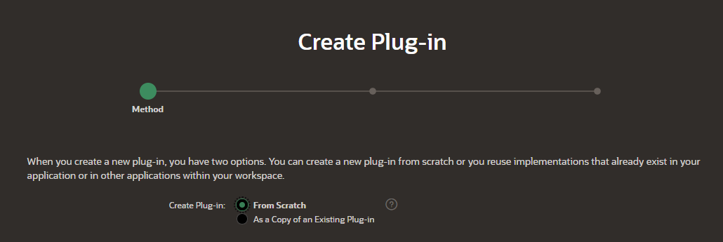
To start we have to create a Plug-in in the shared components
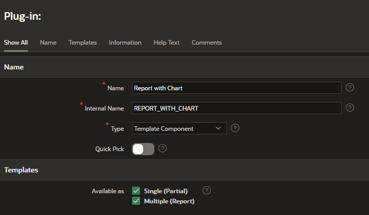
Give the Template Component Plug-in a name and select „Available as Single and Multiple“ to use the Plug-in both as a region and in a report.
The Partial part is to describe how to render the Template Component and set our custom attributes. Here is an excerpt from my code to include the chart:
...
<div class="tblrow">
    <div class="tblc">
      <div class="item">
        <div><canvas class="myChart chartjs-render-monitor" id="#CHART_ID#" height="50" data-z="#DATASETASARRAY#" data-d="#DATASETDATEARRAY#"> </canvas></div>
      </div>
    </div>
  </div>
...
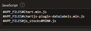
In this code we set 3 custom attributes: „#CHART_ID#“, „#DATASETASARRAY#“ and „#DATASETDATEARRAY#“. We use custom attributes to fill it with data later in our SQL query. The last step in the Plug-in is to define the Java-Script files to load. We do that in the „JavaScript“ section of the Plug-in. If we use static files we have to upload the files in the shared components before we can use it. In my case I use the Chart.js library and added a seperate config file. I took this config file from an example and will adapt it to my needs in the next days. But for now it works and displays the chart.
function draw_chart(datava, datada, canvaceid){
var canvas = document.getElementById(canvaceid);

var data = {
    labels: datada,
    datasets: [{
      backgroundColor:"#056ac8",
      borderColor: "#056ac8",
      pointStyle: 'triangle',
      data: datava,
      datalabels: {
        align: 'end',
        anchor: 'end'
      }
    }]
  };

var option = {
legend: {
        display: false
  },


  plugins: {
      datalabels: {
        backgroundColor: function(context) {
          return context.dataset.backgroundColor;
        },
        borderRadius: 4,
        color: 'white',
        font: {
          weight: 'bold'
        },
        padding: 6 ,
        formatter: function(value, ctx) {
          var index = ctx.dataIndex;
          var label = ctx.chart.data.labels[index];
          return (value*100).toFixed(2)+"%";
        }
      }
    },

    // Core options
    aspectRatio: 5 / 3,
    layout: {
      padding: {
        top: 32,
        right: 16,
        bottom: 16,
        left: 8
      }
    },
    elements: {
      line: {
        fill: false,
        tension: 0.4
      }
    } ,
    scales: {
    yAxes:[{
          ticks: {
                beginAtZero: true
            },
        display:false
    }],
    xAxes:[{
      barPercentage: 1.0,
        categoryPercentage: 1.0,
        gridLines: {
          display:false
        },
        scaleLabel: {
        display: true,
        labelString: "Datum"
      }
    }]
    }
  };

var myBarChart = Chart.Line(canvas,{
  data:data,
  options:option
});

}
In my case I would like to display a report out of the new created Plug-in. To do that I selected the plug-in as type and put the SQL Query in the corresponding field (excerpt from my query):
select a.ID,
        ...
        (   select listagg(regularmarketpreviousclose, ';') within group(order by datum) as closevalues
                from st_stocks_historie
                where trunc(datum) > TRUNC (SYSDATE, 'YEAR')
                and stock_id = a.id
                 group by symbol
            ) as messuares_values,
            (   select listagg(to_char(datum, 'DD.MM.YYYY'), ';') within group(order by datum) as closedate
                from st_stocks_historie
                where trunc(datum) > TRUNC (SYSDATE, 'YEAR')
                and stock_id = a.id
                 group by symbol
            ) as date_values
        ...
  from st_stocks a ...
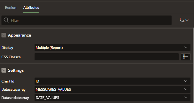
The last step in the region settings is to assign our custom attributes with the result from the query:
To „activate“ our loaded JavaScript library we have to call the „draw_chart“ function with the parameters. First I called the function in my Plug-in with the result that the chart was visible only for a short second after page loading. I then remembered another case where I had to load the JavaScript after the whole page was loaded. To do that we can call our JavaScript function in the „Execute when Page Loads“ in the page settings:
    // call the function for each row
    var els = document.getElementsByClassName("myChart");

    for(var i = 0; i < els.length; i++)
    {
    var c = els[i].dataset.d.split(';');
    var b =  els[i].dataset.z.split(';').map(function(item) {

        return parseFloat(item, 10);
    });

    eval("draw_chart(b,c,els[i].id)");
    }
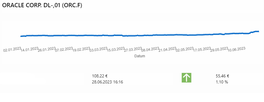
With calling the function we include our three parameters. If we run our application/page we will see now our report with all fields from the SQL Query and in each row the chart for this dataset:
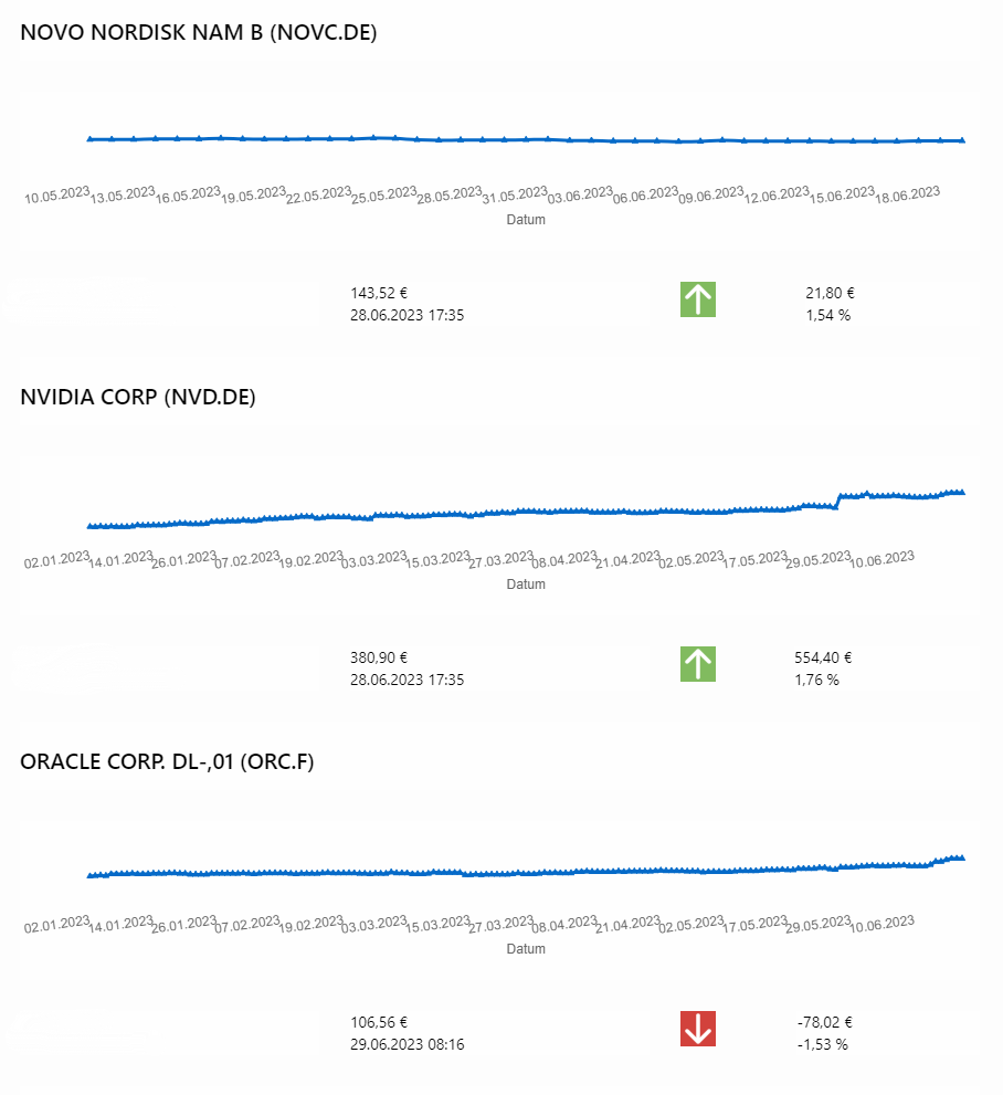
If you ask yourself where the colored arrows are coming from? This are also defined as custom attributes in the plugin and display Icons depending on a „case when“ clause in my SQL query.
